Suzuki Changes Its Logo After 22 Years: Why Car Brands Are Saying Goodbye to Chrome and Embracing Flat Design
Introduction: A New Era in Automotive Identity
The automobile industry is not just about engineering, horsepower, or advanced technology. It is also about emotions, trust, and identity. One of the strongest visual elements of any car brand is its logo — a symbol that connects millions of customers to the brand at first glance.
That’s why when a global giant like Suzuki Motor Corporation decides to change its logo after 22 years, it’s not a small update. It’s a sign of a deeper shift in branding, design philosophy, and the direction of the entire industry.
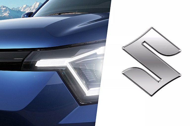
In 2025, Suzuki unveiled a brand-new logo, replacing its traditional 3D chrome emblem with a modern flat design in high-brightness silver paint. This decision has sparked discussions worldwide: why are car brands across the globe abandoning their shiny, heavy-looking logos and moving toward minimalistic, flat visual identities?
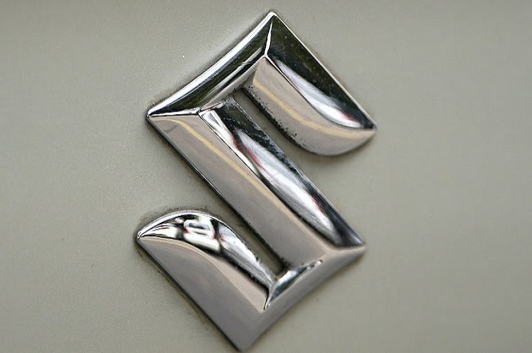
The Old Suzuki Logo: A Legacy of Strength and Recognition
Since 2003, Suzuki’s 3D chrome-finished logo has been an integral part of its vehicles, first appearing prominently on the third-generation Wagon R. For over two decades, this emblem represented strength, durability, and a sense of timelessness.
Customers didn’t just see it as a design; they saw it as a mark of trust. On the grille of every Suzuki car, this shiny logo stood out from a distance, offering instant recognition and brand pride.
But as customer expectations evolved and digital platforms became the first point of interaction, the old chrome-heavy emblem began to feel dated.
The New Logo: Flat Design with a Modern Edge
Suzuki’s new emblem leaves behind the glossy 3D chrome look. Instead, it embraces a flat, minimalist design finished in high-brightness silver paint. The result is a clean, sharp, and modern identity that works equally well on vehicles, mobile screens, and digital campaigns.
Flat logos are easier to reproduce across various mediums, ensuring that Suzuki’s brand remains recognizable whether it’s on a smartphone app, a billboard, or the bonnet of a new electric car.
Why Car Brands Are Redesigning Logos Globally
Suzuki’s bold step is part of a much larger trend across the automotive world. In the past decade, nearly every major car brand has simplified its logo.
Here are the key reasons behind this transformation:
- Digital Compatibility
Flat logos work better on apps, websites, and social media platforms. They remain sharp and clear, even on the smallest smartphone screens. - Minimalism and Modern Values
Today’s consumers associate clean, simple designs with sustainability and progress. Heavy, glossy logos are being replaced by sleek visuals that symbolize modernity. - Universal Visibility
3D chrome logos can appear distorted under different lighting conditions. Flat designs, however, maintain clarity and visibility across all surfaces and backgrounds.
A Word from Suzuki’s President
Toshihiro Suzuki, President of Suzuki Motor Corporation, highlighted the deeper meaning behind the new emblem. He said the new logo represents the company’s commitment to facing future challenges with confidence and adaptability.
This statement makes it clear that the rebranding isn’t just cosmetic. It is about preparing Suzuki for a future where electric vehicles, digital ecosystems, and global sustainability will dominate the automotive landscape.
Global Trend: Suzuki Is Not Alone
Suzuki is not the first automaker to embark on this journey. Many global brands have already embraced the flat logo trend:
- Volkswagen switched to a flat, simplified design to align with its digital-first strategy.
- BMW redesigned its logo, moving away from its traditional 3D look to a transparent, minimalist version.
- Kia went even further, unveiling an entirely new typeface and visual identity to appeal to a younger generation.
This clearly shows a worldwide movement — where automobile companies are reinventing their visual identity to stay relevant in a fast-changing, digital-first world.
Impact on the Indian Market
India is Suzuki’s largest market through its subsidiary Maruti Suzuki. Millions of Indian customers have grown up seeing the classic 3D emblem on their cars, from hatchbacks like Alto to SUVs like Brezza.
The new flat silver logo will:
- Give a modern, premium feel to future Maruti Suzuki cars.
- Help younger buyers connect with the brand, especially those who value design and digital relevance.
- Create a fresh brand image in advertising, social media, and marketing campaigns.
Though some loyal customers may initially miss the shine of the old chrome emblem, over time the sleek new design will become synonymous with modernity and trust.
Why Logos Matter So Much in Branding
A logo is more than just a design; it is the face of a brand. It communicates values, vision, and reliability in a single glance. By changing its emblem after 22 years, Suzuki has sent a powerful message: the company is evolving, adapting, and preparing itself for the next generation of mobility.
For Suzuki, this isn’t just about aesthetics. It’s about strengthening brand loyalty, appealing to young buyers, and signaling its readiness for electric vehicles and digital transformation.
Challenges and Opportunities Ahead
Every change brings challenges. Some long-time customers may feel nostalgic about the old emblem. Yet, opportunities far outweigh these concerns:
- New-Age Customers: Millennials and Gen Z buyers are drawn to modern, minimalistic aesthetics.
- Electric Vehicle Future: Sleek, flat logos look futuristic and perfectly match EVs, where design minimalism is key.
- Global Recognition: A flat, consistent logo improves brand visibility across different countries and platforms.
Conclusion: A Bold Step into the Future
Suzuki’s decision to redesign its logo after 22 years is not just a cosmetic refresh. It symbolizes a new chapter in the brand’s history — one where simplicity, modernity, and digital relevance are at the forefront.
By moving from 3D chrome to flat silver, Suzuki is aligning itself with global design trends, preparing for the electric era, and ensuring its visual identity remains timeless.
The next time you see a brand-new Suzuki car on the road, its sleek silver emblem will stand not just as a badge of identity but as proof that the brand is evolving with the times. This bold move ensures Suzuki will continue to remain close to the hearts of millions of customers worldwide, not just for the next few years but for decades to come.